Showing posts with label Planning. Show all posts

Saturday, 28 January 2017

Billboard Apple App Store/Google Play Store Icon

I created my Apple App Store and Google Play Store icons by emulating real ones. This was to make sure my billboard was fully created by me, and that I had not used online images.

I did this by drawing the logos by hand, and then scanning them into Adobe Photoshop. In Adobe Photoshop I was able to rectify any mistakes I created on the paper such as, drawing out the line. In Adobe Photoshop I was also able to contrast my lines in order to make the image much more sharper. To create the rest of my icon I used Adobe InDesign, this software was very easy to use as I had sufficient knowledge on how to programme it. I spent extensive amount of time finding the correct font, that is most similar to the real App icons. For the Apple App Store Icon I used the font 'Calibri (Body). For the line 'Get it on' and 'play', on the Google Play Store I used Adobe Fan Heiti Std B, and for the line that reads 'Google' I have used the font 'Adobe Devanagari'.

Radio Advertisement - Improvements

After recording and producing my radio advertisement, with my voice, I was very happy with it. I believed the production and editing sounded very professional and realistic. However, a feedback note I was receiving a number of times, by my peers and other people I played my radio ad too, was that my voice did not sound like the common voices used in real life radio ads. After listening to my radio ad a number of times, I started to agree. My voice sounded very joyless. When researching radio advertisements I discovered that many real life ads use adults (mainly female) 25+ to perform their script. After noting the feedback, I made sure I would improve my piece. I asked my sister to perform my script. Immediately, my ad sounded much more realistic and joyful.

My original radio ad -


My improved radio ad -

Thursday, 26 January 2017

Billboard - Location

To make my billboard very prominent and noticeable, I would like it to be displayed in many different locations. One particular place is outside news agents around Bristol. I believe this would be a good location, as people will already be entering the news agent, they will be intrigued and feel inclined to purchase the paper. Other locations would be in local supermarkets and on the side of infrastructures.
I think also having my advert displayed on the side of transportation would be very beneficial in terms of people seeing it and being interested. It is very common for local transportation to be advertising local businesses.

Radio Advertisement

Where? When?
As the target audience for my local newspaper is people who reside in Bristol, I would have my radio advertisement broadcasted on Bristol radio stations such as Heart FM, BBC West/BBC Radio Bristol, and Southsound Radio. As these are all radio stations that are only concerning the local area, Bristol, it is very realistic that they contain adverts for local companies.
I would have my radio advertisement broadcasted during the morning hours, this is because this is the most common time people purchase newspapers, People mainly purchase newspapers in the morning as it can inform them on how the day will manifest, as local newspapers usually contain information regarding road closures, weather, events etc.

Production
I created my radio advertisement on Apple iMovie. I decided to use this software as it was readily available and was fairly simple to use. For the background music I used a song that is already programmed into iMovie, 'Playful'. I decided on using an already built in song, as it means these have no copyright restrictions. I chose Playful as it is very joyful and catchy, this is very important in terms of creating a radio advertisement, as it gives connotations of happy and bright.
Using iMovie, I was able to manipulate different parts of my radio ad, such as the volume of the speech and background music. After gaining feedback from my audience, I discovered my background music was much too loud, to resolve this issue I did more manipulations to my radio advertisements, such as having a 'fade in' and 'fade out' effect.
My radio advertisement is precisely 25 seconds long. After doing immense research into radio adverts in general I discovered this is the most typical length. I decided to follow this convention as it not only makes my radio ad seem as realistic as possible, but it also does not lose listeners interest.
By following the conventions of real radio advertisements, I have produced an ancillary that is very realistic.

Script
This is the script that will be spoken during my radio advertisement. 

"Do you want to be kept up to date with the latest news in Bristol? Would you like to know important events happening in your city? For only 45p you can pick up a copy of Bristol’s greatest newspaper Bristol Bulletin! It is available at most news agents, OR you can download our new mobile application for free and have a chance of winning £1000 worth of apple products! Don’t miss out."

Wednesday, 25 January 2017

Billboard Advert Mock-up

When creating my billboard this will be the structure/layout I will follow. I am very happy with this design as I feel it follows the typical conventions of real billboards. I will include information regarding the Bristol Bulletin website and the new Bristol Bulletin App. I will also include information on the promotion of 'Winning £2500 worth of Apple products if you download the new mobile application', as this is a promotion I have advertised in my radio ad and newspaper front page it creates synergy. Creating synergy is a very common thing real local newspapers do, as the repetition can become very memorable, which is a very easy way to make viral promotion. I believe all these elements will create a realistic, effective billboard.

Wednesday, 7 December 2016

Advert Ideas

The adverts I have decided I will be using in my local newspaper are: promotion to 'win £1000 worth of Apple products' if app is downloaded, conservatory fittings company, indoor furniture company, and outdoor furniture company. After doing immense research into the real adverts used in local newspapers, I discovered these were the most common. I decided to use realistic adverts because it can help reinforce the realism of my production.

To promote the Bristol Bulletin application and Apple products prize, I created an image of an iPhone held in hand, with it displaying a portion of my inside page. To create this image I heavily used Adobe Photoshop. I began by removing the background, I did this not just because it looks aesthetically pleasing, but it also reflects the actual convention of ears used in local newspapers. I also used Photoshop, in order for it to look like the iPhone was displaying my inside page.

Through thoroughly researching local newspapers, and what advert they all typically have, I discovered that nearly all of them have some form of home improvement advertisements. This is the main reason I decided I will definitely be using a conservatory fittings company in my piece, as I want it to look realistic as possible. To create this advert, I took inspiration from existing conservatory advertisements, I discovered that a common convention is to feature images of a conservatory at different angles. After making adjustments on Adobe Photoshop to make the images of higher quality, I imported the images onto Adobe InDesign, to make the advertisement.


Tuesday, 6 December 2016

Images

After deciding on what stories and adverts I will be using in my local newspaper, I created a plan on what, and where to take my images.

This is a list of the stories and adverts I will be using, with a description of the image I will be using to present them:

-'Suspension Bridge is closing down' - I will go to an easily accessible area to take a wide shot image of the Suspension Bridge and its surroundings.

- 'Homeless man becomes a global successful musician' - For this image I will either go to a location which I know has many homeless people and ask their permission to take an image. Or ask one of my friends to pretend to be homeless, with the use of 'mise-en-scene' to make it look as realistic as possible.

- 'Criminal Pair' - I will take a high angle shot from above, to make it look as if it was photographed from a CCTV camera.

- Furniture advert - I will take an image of my furniture, and then manipulate it.

- Conservatory advert - I will take an image of my conservatory, and then manipulate it.

- Property for sale advert - I will take images of the location

Photographing the Suspension Bridge, was much more difficult than I anticipated. I went a variety of areas, in order to take a successful image, but I was mostly dissatisfied with the results. I also faced challenges such as making sure weather visibility was clear, as some of my images had a lot of noise. After carefully critiquing my own images, I whittled down to just 5 different options.

They were all taken in a location much further from the bridge, but I knew I would be able to crop down my images and not sacrifice quality, as I used a camera with a high megapixel count. After further critiquing my images, I settled with the second image, this is because I believe it to have much more clarity compared to the other images, and it also was the most easy to crop. After cropping the image to just the Suspension Bridge, I was very happy with the results.
 

Taking an image to represent my homeless man story was much more easier than I anticipated. I went to Bristol Bear Pit, where I met a homeless man, and after asking his permission, he allowed me to photograph him sitting down playing his guitar. I am very happy with the result of this image, as it is not only authentic to the real representation, but it also fits my story article perfectly, as he was playing an instrument. Having an image of a real homeless man, also made it easier for me, as I did not have to ask my friend to dress up. I am also very pleased with this image, as it is a very successful close-mid shot, this is a shot type that is often used in newspapers.

For my criminal pair story, my plan was to take a photo of a large crowd in a busy shop. This proved to be very difficult, as on many occasions I could not get higher enough to take a high-angle shot. However, after many attempts I managed to take the perfect image. I was on the second floor of Cabot Circus Shopping Centre in Bristol, and I took the image of a shop below.

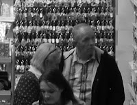
As I knew this story was not going to be a main story, I decided to crop the image to a very small size. I then began the manipulate the image to the style I was happy with. To do this, I used Adobe Photoshop, in this application I was able to grey-scale my image, to make it look as if it was taken from a CCTV camera, and I was able to change the shape. I changed the shape to a circle, I gained this influence from the 'Bristol Post', on many of their small articles, they include images in different shapes. This is done as it makes the layout look more attractive.

 For my flat property advert images, my plan was take a panoramic image of Bristol City Centre. This proved to be fairly simple, as all I had to do was go up a very large car park and take images.

The three images I took were all very similar, so I just decided on the image I felt had a higher quality.

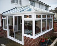
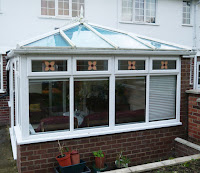
For my conservatory advert, I took two images of my conservatory from different angles. I was influenced from an advert I saw in the 'Bath Chronicles', they had a wide range of angles of the same home extension to show its detail.

I was not pleased with the images I had taken, as the moss and other factors made the conservatory look very unattractive. To rectify the images, instead of taking new ones, I edited my two images on Adobe Photoshop. I removed the unappealing green-tone in the gutters, by using the paint tool to change it to the surrounding colour, which made my images look significantly better. I then increased the brightness and made other adjustments, in order to make it a much more captivating to the readers.


Logo

After thoroughly researching local newspapers, I discovered a large majority of them include a logo, that is significant to their location, in their masthead. The logo's were mostly black cartoon-esque visuals of buildings or other figures, that the location was historically known for. I will be using a logo in my newspaper, as it will make my final piece look as realistic as possible, and as attractive as possible.

As I decided in the beginning of my planning that I will be setting out my local newspaper in Bristol, I decided to conduct some research on the icons that Bristol is historically known for. An advantage of mine was that I have lived in Bristol my entire life, so I am very familiar with what the residents of Bristol deem to be iconic. Some of my ideas were, SS Great Britain, the Suspension Bridge, and Cabot Tower.

I decided I will be using the Suspension Bridge. This is because I believe people who see the logo will immediately know who and what the newspaper is representing. Whereas, the other 2 are not as easily as identifiable to be related to Bristol.

My idea was to draw out an image of the bridge and then scan it in, this was the result:
 I was dissatisfied with the results, as the black was much more washed out than anticipated.

 My plan was to improve the image quality by manipulating it in Adobe Photoshop. I contrasted the image, made the brightness much lower and cropped it, the results were much better. However, I was still not totally happy with it. It still looked very amateur, and not the quality you would expect to see in a real local newspaper.

So, I believed my only method of improvement was to not digitally enhance my image, but to adjust the physical copy. I went over the lines I drew with a thick felt tip marker, and then scanned the image in. The result was a much higher improvement, it looked much more professional and realistic. I am much more happy with my masthead logo now as it is now easily recognisable to what I was attempting to show.


Story planning

I have created a mind-map illustrating my different story ideas, which I may include in my newspaper. I have attempted to come up with a variety of ideas, that from my research, I feel would be appropriate to include into a local newspaper, 


The stories I will be using in my newspaper are - 

- 'HOMELESS MAN BECOMES A GLOBAL SUCCESSFUL MUSICIAN'
- 'SUSPENSION BRIDGE IS CLOSING DOWN'
- 'SCHOOL CHILDREN HOST A FUNDRAISER EVENT'
- 'PAIR OF CRIMINALS, TRAVELLING THE COUNTRY'

Stories

'Is This Really The End of Brunel's Suspension Bridge?'
After many years of faults, and unreliable reports. Bristol City Council, has finally announced to close the beloved suspension bridge, permanently.
It was first announced in 2011, that the Council, deemed the bridge to be ‘unsafe for the amount of traffic that travels through it daily’. After this report was published, the council spent over 2 years, reinforcing the existing structure, whilst also attempting to develop more support. With such a unique and complex formation, their plans to rebuild, ended unsuccessfully.
The council is fully aware, that many people rely on the bridge, in order to get in and out of the city. So they have announced they are looking to create a new bridge, in the same location. They will demolish and develop a brand new design.

'From Living in Bristol’s Bear Pit, To Living in a Lavish Apartment in Chelsea, London!'
From Aug 2014 to March 2015 Erik Payseur was living in a 2-man tent in Bristol’s Bear Pit. Whether it be night or day, cold or hot, Erik was always there busking for money. 
He was made homeless in 2014, due to his deranged partner committing suicide. Not being able to afford rent, Erik lost his house and become redundant. He believed he was destined for misfortune. His life was turned upside-down on new years eve. Lyor Cohen the founder of ‘300 Entertainment’ record label, was in Bristol, as one of his artist, Rejjie Snow, He came across Erik singing a cover of Archy Marshall’s song ‘Out Getting Ribs’. We spoke to Lyor and he said ‘I decided to go for a walk in Bristol, as I had never been there before and what I found was something magical. Erik, was sat there singing . I was so taken back by his vocals, as I can honestly say I had never heard anything like that. I knew immediately. I has to sign him.’
This was the turning point in Erik’s life. Just two weeks later, Lyor and the other members of ‘300 Entertainment’. helped house Erik. He was now living in a shared flat in South London. He was introduced to the other artists and he became close friends with a singer named Jamie Isaac, 4 months after their initial meeting, they recorded a single together named ‘Last Drip’.  It was a national success, just two days after the release, it was announced it was the ‘Number 1 Single Downloaded’ song of the month. Erik’s sudden fortune, enabled him, to buy his own property, in one of the most affluent parts of the country. Erik, is now recording his first full length LP, in Metropolis Studios.

'Know This Couple?'
POLICE are looking for this couple in connection to a string of petty thefts. They were captured  on CCTV months ago, stealing goods from WHSmith, and last week Smiggle, a children's toy shop in Cabot Circus, recorded the devious couple purloining expensive toys. They have been described as both being white and in their late 40s.
Crimestoppers: 0800 666 222

'We Need Your Books!'
Over 1000 books were damaged in the fire that happened at Bristol Sea Mill’s library on Tuesday afternoon. The fire was ignited after a librarian, used a faulty coffee machine, which triggered a fuse to explode. 
On Friday 18th Nov (9AM - 1PM), there will be a fundraiser event, located in Sea Mills park. It will entail cake sales, face painting and music, with all the money raised going directly to help reconstruct the library. There will also be opportunities, to donate books and other non-financial aids.

Wednesday, 30 November 2016

Layout

This is a post which will present my planning ideas for my front cover and inside page. I have created two of each, and I will be explaining which is my preferred option.

FRONT COVER
1

This is my first idea. I do not entirely like this option as it is very boring, and seems quite out of date. And what I noticed from researching local newspapers, is that they all seem to have quite a creative design.

2

 This is my preferred front page layout design. This is because it seems a lot more modern in comparison to my other idea. Having a sleek design can increase more people to purchase my product and can attract younger readers. It also makes it more attractive to look at. I gained inspiration of having a large advert banner from the 'Bristol Post'. Having features, that are common in local newspapers, will hopefully make my final piece as realistic as possible.

INSIDE PAGE 

1

This is my first idea for my inside page. I do not like this design as it is very boring. All the articles are the same or similar size, placed in similar places, this method of designing is known as 'tomb-stoning', and doesn't look very appealing.

2
  
This is my favourite option for my inside page, as it features enough article text to please the readers, but not too much to become a broadsheet. It also has enough room to include promotions and adverts. Having a large advert banner at the bottom of the inside page is something i noticed to be very frequent in local newspapers. Including conventions from local newspapers will make my final piece look as professional as possible.


Tuesday, 8 November 2016

Planning - Masthead Name Ideas


To make sure I have a range of masthead name ideas, I created a mind map to help me. This allowed me too develop and create new ideas, easier.

I chose these 6 potential masthead names as they all contain words, which have heavy connotations to newspapers. - such as 'Daily', 'Report', and 'Bulletin' . I gained these influences throughout my research, of local newspapers. I believe having a masthead with one of these nouns, will make my final product look as realistic as possible. Another reason why I created these 6 words, is they all contain a location that the news is concerning. This was a feature I saw being used very frequently with local newspapers. As I was already aware my newspaper would be based on Bristol, I made sure to include it into my names. I also attempted to vary my chooses and use words which have connotations to Bristol, or they have a very significant meaning to Bristol. - such as 'Avon'.